Versatile.ai builds CraneView, a web and mobile platform that helps steel erection contractors track construction progress by combining crane-mounted camera data, AI, and BIM (Building Information Modeling, a 3D digital model of the building) models.
I joined as Product Design Lead reporting to the VP of Product Management, running a small design team while also working hands-on as the lead designer on platform-level features.
One of CraneView’s most-used screens is the 4D Viewer: a 3D, timeline-driven view of a project’s progress. This case study covers its redesign.
Summary
The page, then still called Track, was already the most used feature among steel erector PMs (project managers): 75% opened it weekly. But it only colored the BIM model by installation date, within a manually picked date range. I led its transformation into the 4D Viewer: multiple coloring modes, a continuous timeline, video export.
The problem
Steel PMs make high-stakes calls with incomplete visual evidence. Internally, we kept hearing the same pattern: a room full of people arguing about sequencing or delays with no shared reference to point to. Track’s coloring logic didn’t match how PMs actually think about a site: what’s on-site, what’s erected, what’s outstanding. Picking a date range before seeing anything added friction to a page people opened daily.
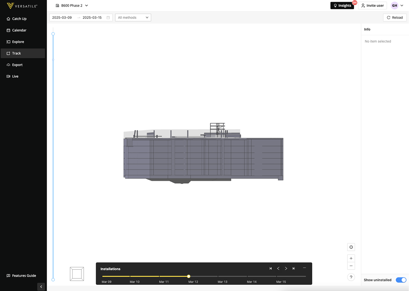
Three limits stood out. The date-range picker only let you look at up to two weeks at a time. Colors only ever distinguished one day from another, with no further meaning attached. And the timeline itself was a simple slider, with no room to grow.
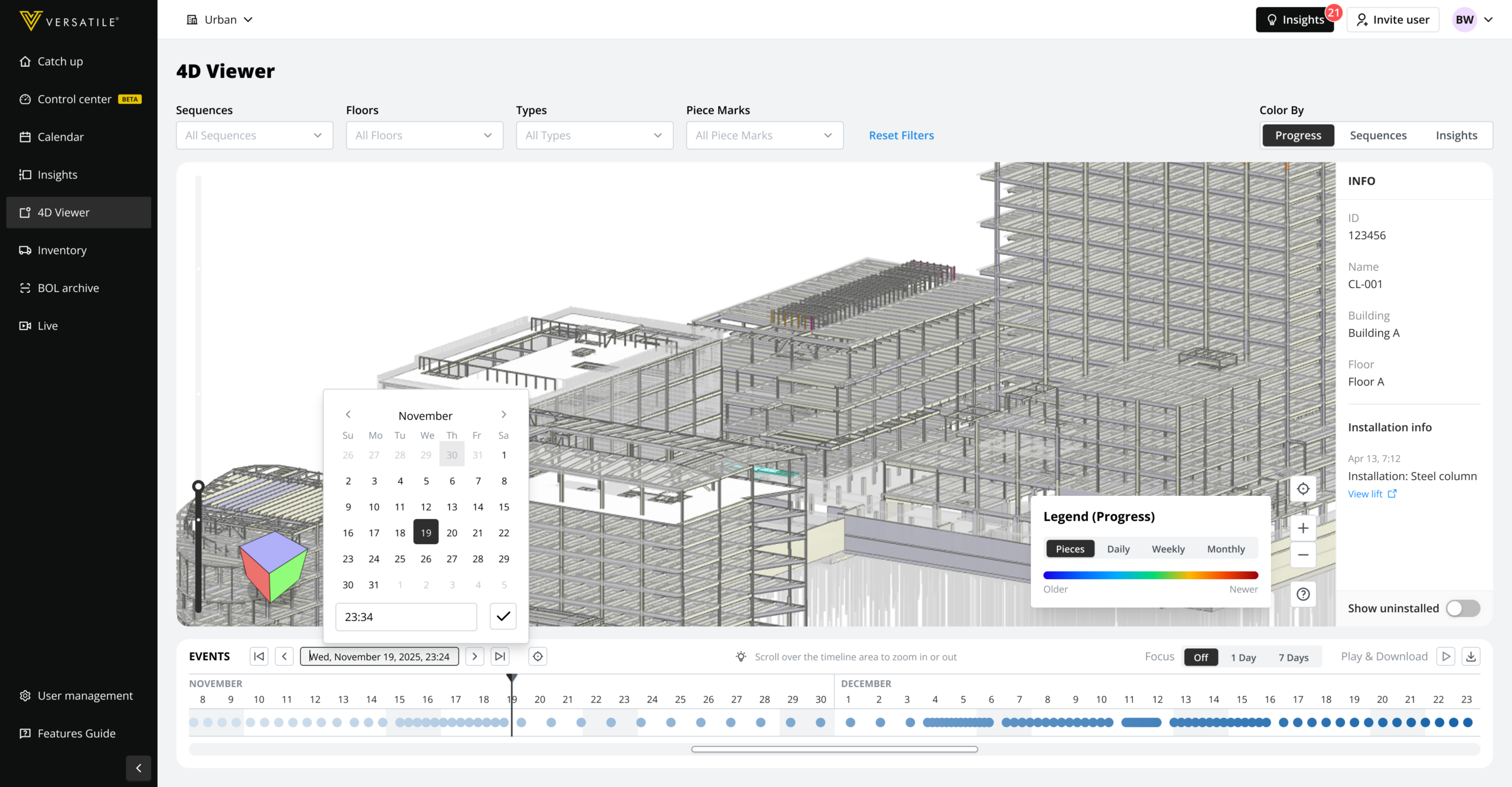
The original Track page before "the big change"
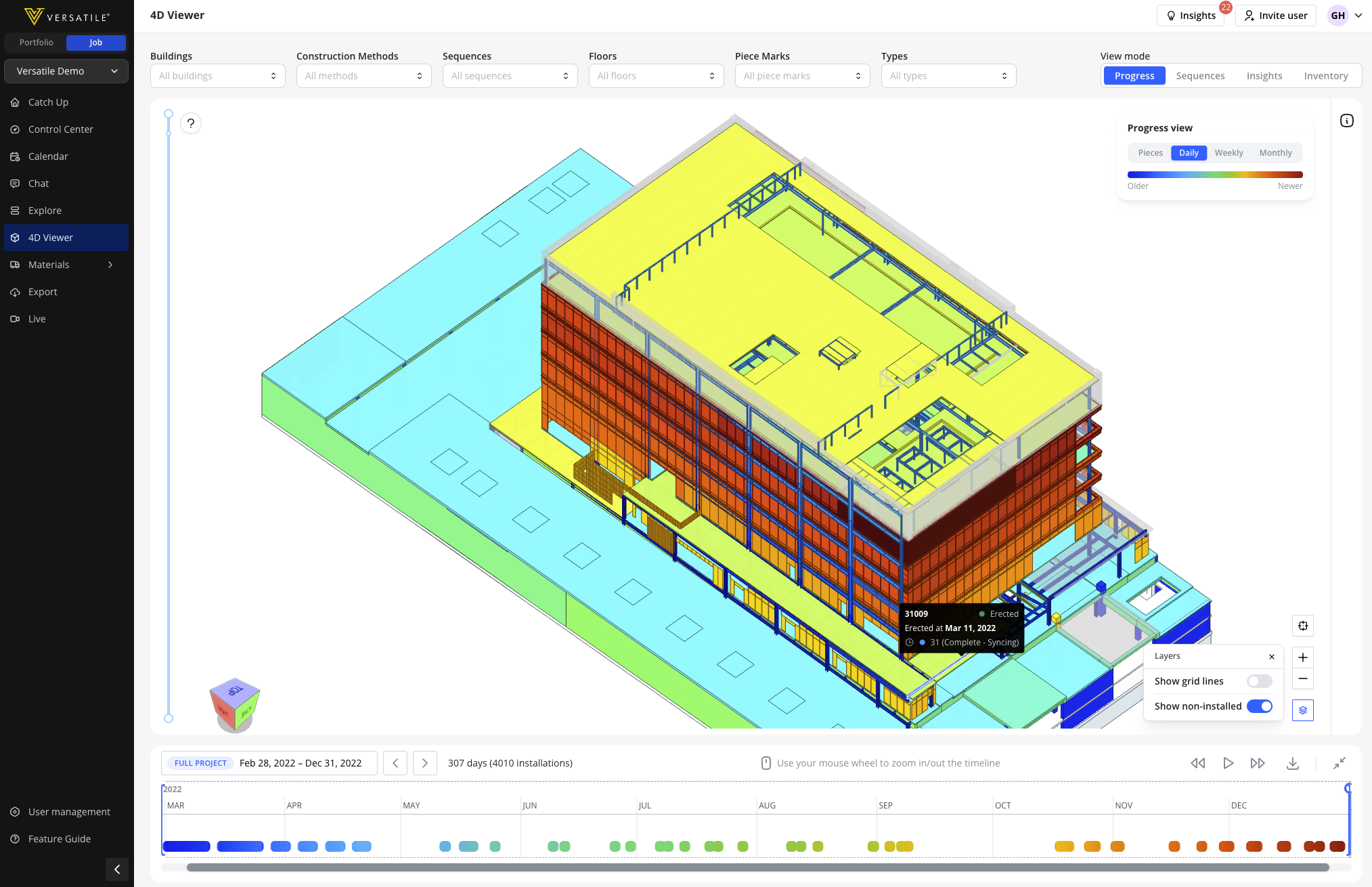
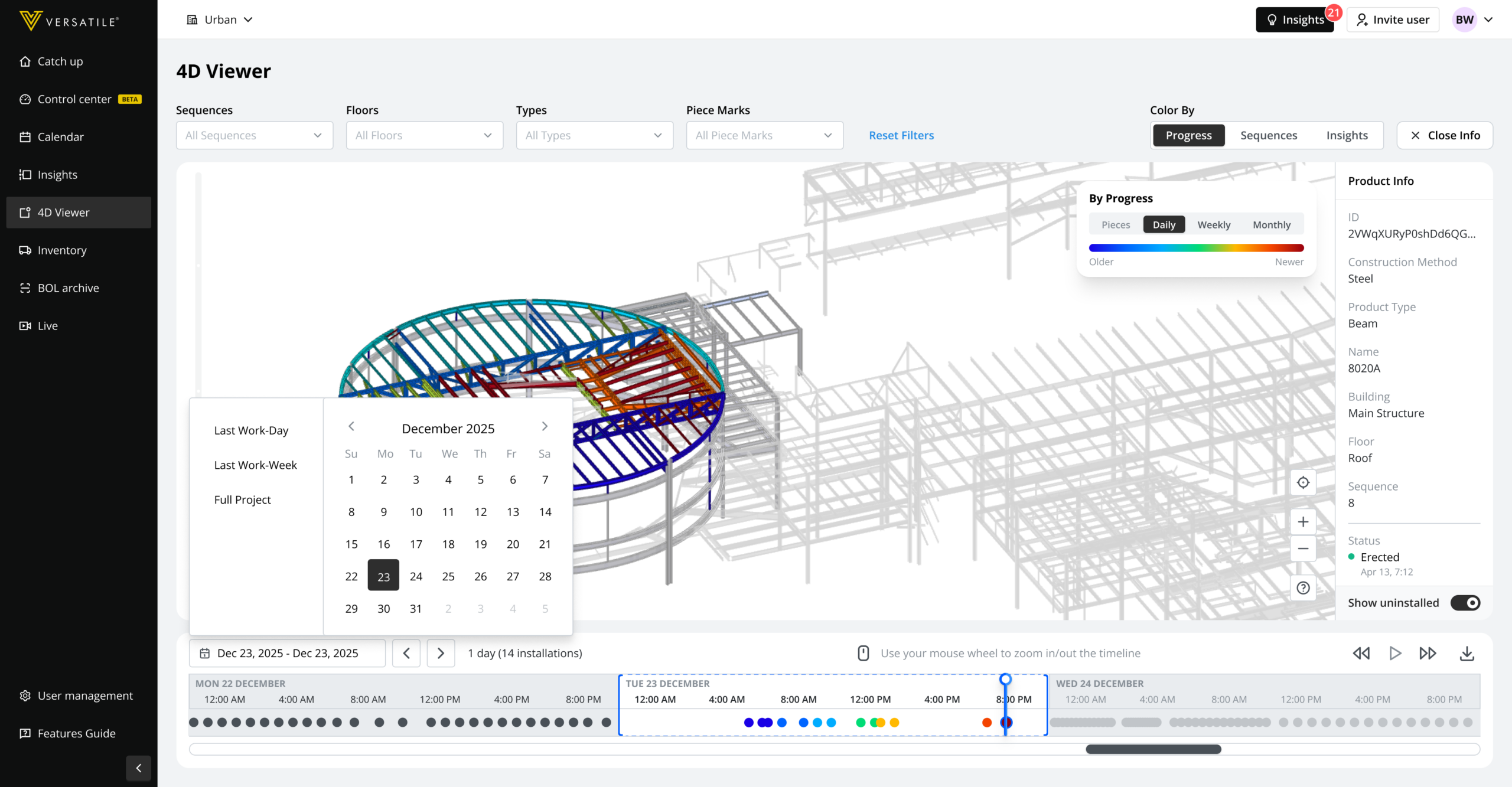
The current 4D Viewer (Previously Track page)
One design partner’s VP of Operations, in the steel erection industry, put it plainly during early discovery: “I could teach everyone in 90 seconds what takes a day and a half.” That gap, between what the tool showed and what a PM needed to explain, was the whole brief.
My role
Design lead, end to end, from initial discovery through General Availability, paired directly with our Product Lead on scope and most design decisions. I defined the core interaction model: how coloring, filtering, and the timeline relate to each other and the BIM model. The product rename from “Track” to “4D Viewer” was a team call I fully backed rather than one I personally drove.
Key decisions
Each change maps back to one of the limits above.
Kill the date-range picker. Solves the two-week ceiling. A continuous, scrubbable timeline spanning the full project replaced the old range picker, with play/pause, variable speed, and full-project zoom. PMs can move from “what happened yesterday” to “how has this project gone overall” without re-picking a range every time.
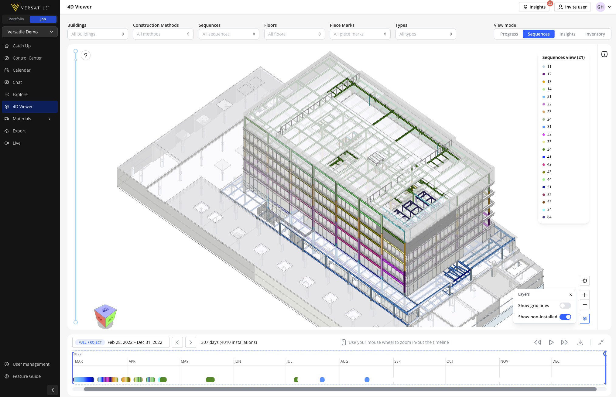
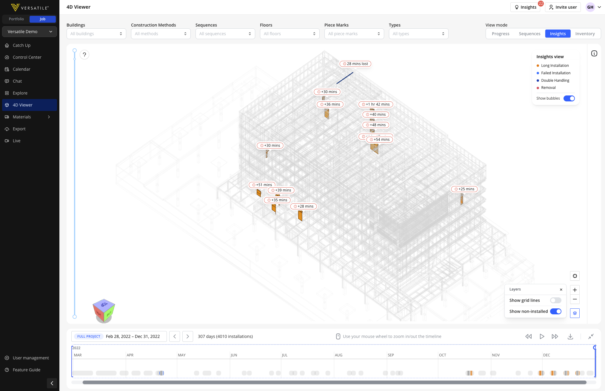
Coloring, not just progress. Solves “color had no meaning.” Three coloring modes replaced the old single day-by-day view: Progress (piece by piece, daily, weekly, monthly grouping), Sequences (color by planned work batch, so PMs can spot out-of-order work), and Insights (auto-flags long installs, failed installs, double handling, removals).
The current 4D Viewer (Previously Track page)
Color by Sequence
Color by Insights
From slider to platform. Solves “no room to grow.” The old timeline was a simple slider: one control, one job. Rebuilding it as a detailed, central component gave later features a place to plug into instead of needing their own separate control each time.
Record to MP4. Solves the missing-evidence problem. PMs needed proof they could put in front of a general contractor (GC) or supplier without re-explaining everything live. One click turns any view into a shareable video, so the PM’s case can travel without the PM.
Familiar mental models. Solves the friction of a brand-new interaction. Filtering modeled on flight-search filters; the timeline modeled on the Gantt charts PMs already use daily. The goal was zero learning curve for a page people already opened every day.
The turning point: turning a failed first impression into how the whole page reads
The first version of the timeline shipped to alpha, and the feedback wasn’t good. Not “it’s broken,” but something quieter and harder to fix: “I don’t get it,” “it doesn’t help me.” For a page meant to be the most immediately useful thing a PM opened, that’s a real failure.
Worth being precise about what changed and when. The old Track calendar could already pick both a single date and a range, just capped at two weeks. Early in the rebuild, we split that in two: the new calendar picked a single date only, and a separate “Focus” control (1 day / 7 days / off) was meant to handle range and highlighting on its own. That split started as a proposal from an AI coding assistant, and the team validated it because the logic held up cleanly on paper. It’s also what shipped to alpha, and what didn’t work.
The Alpha version that performed poorly in testing
The cause was a perception problem, not a logic problem. While walking one of our Account Managers through how it worked, ahead of a client conversation, his reaction gave the failure away: he assumed the highlighting was just how the page behaved by default, not a second setting layered on top of the calendar he’d already set. People weren’t misreading the feature. They were reading the page correctly, and the page was built wrong for that reading. It took stepping back from the original logic to see it: AI gives you an airtight theory, not always a match for how people actually read a page.
The fix looks small: fold the “Focus” control into the calendar picker itself, and give the calendar the range functionality it never had. The old “off” state, showing the full project with nothing specifically highlighted, became a preset inside the calendar (“Full Project,” next to “Last Work-Day” and “Last Work-Week”). The link now runs the other way too: whatever date or range gets selected on the calendar is what drives the highlighting, on the timeline and on the 3D model both.
The final version: fixing UX issues and performing much better
Visually, the calendar looks like it always could do this. Structurally, one control disappeared into the other, and what used to be two things to configure became one thing that behaves the way it already looked like it should, on the model as much as on the timeline. The whole page stopped feeling like a tool with settings, and started feeling like it just showed you the right thing.
I couldn’t be certain it would work, only that leaving the page split across two controls, after people had already told us it didn’t make sense, would leave the failure in place. I brought the call to our Product Lead, who backed reopening something the team had just shipped and called “validated,” and the engineers stayed open to rebuilding it. The feature started making sense in customer conversations, and it unlocked follow-on features that the old split-control version had made hard to justify.
Rollout and impact
Shipped behind a flag: internal only during development, then an open beta for Steel customers, then General Availability (GA) to all active sites. The headline bar set upfront was adoption: more than 10% of customers using the new viewer weekly, against a baseline of 2 Steel Erector customers in early 2025.
By the time of an internal company-wide data review, the 4D Viewer had reached a 91% weekly activity rate, and Steel Erector customers using it had grown to 16, up from that baseline of 2. Across the whole platform, it was the single most-used feature, ahead of every other page.
Our design partner, the project’s flagship reference account, formally confirmed the redesign delivered real workflow value.
What I took away
The biggest lesson wasn’t about product logic, it was about environment. Reversing a shipped decision the team had already called “validated” is hard on its own. Doing it somewhere that reversal doesn’t feel safe is close to impossible. What made it possible: a Product Lead who trusted the call, engineers who stayed open to re-examining something already built, and a team where saying “I think we got this wrong” costs nothing. That’s what enables good decisions, not just good logic.